In this tutorial, we'll discuss the various types available for the HTML <input> element.
HTML Input Types
The HTML <input> element is one of the most commonly used form elements.
An <input> element can be displayed in various ways, depending on the type attribute.
<input type="text"> (Default)<input type="radio"><input type="checkbox"><input type="submit"><input type="button"><input type="color"><input type="date"><input type="datetime-local"><input type="email"><input type="file"><input type="hidden"><input type="image"><input type="month"><input type="number"><input type="password"><input type="range"><input type="reset"><input type="search"><input type="tel"><input type="time"><input type="url"><input type="week">
Input Type Text
The <input type="text"> defines a single-line input field for text input.
<form>
  <label for="fname">First name:</label><br>
  <input type="text" id="fname" name="fname"><br>
  <label for="lname">Last name:</label><br>
  <input type="text" id="lname" name="lname">
</form>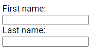
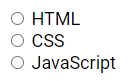
Input Type Radio
The <input type="radio"> defines a radio button.
Radio buttons let a user select ONE of a limited number of choices.
<form>
 <input type="radio" id="html" name="language" value="HTML">
 <label for="html">HTML</label><br>
 <input type="radio" id="css" name="language" value="CSS">
 <label for="css">CSS</label><br>
 <input type="radio" id="javascript" name="language" value="JavaScript">
 <label for="javascript">JavaScript</label>
</form>
Input Type Checkbox
The <input type="checkbox"> defines a checkbox.
Checkboxes allow a user to select zero or more options from a limited number of choices.
<form>
 <input type="checkbox" id="fruit1" name="fruit1" value="Apple">
 <label for="fruit1">Apple </label><br>
 <input type="checkbox" id="fruit2" name="fruit2" value="Mango">
 <label for="fruit2">Mango</label><br>
 <input type="checkbox" id="fruit3" name="fruit3" value="Orange">
 <label for="fruit3">Orange</label>
</form>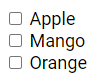
Input Type Submit
The <input type="submit"> defines a button for submitting the form data to a form handler.
The form handler is usually a file on the server containing a script for processing input data.
The form handler is specified in the form's action attribute.
<form action="/submission_page.php">
 <label for="fname">First name:</label><br>
 <input type="text" id="fname" name="fname" value="John"><br>
 <label for="lname">Last name:</label><br>
 <input type="text" id="lname" name="lname" value="Doe"><br><br>
 <input type="submit" value="Submit">
</form>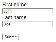
Input Type Button
The <input type="button"> creates a button.
<input type="button" onclick="alert('Button Example!')" value="Click here!">
Input Type Color
The <input type="color"> is used for input fields that should contain a color. Depending on browser support, a color picker may appear in the input field.
<form>
  <label for="color">Color:</label>
  <input type="color" id="color" name="color">
</form>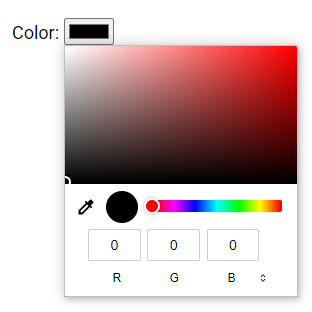
Input Type Date
The <input type="date"> is used for input fields that should contain a date. Depending on the browser's support, a date picker may appear in the input field.
<form>
  <label for="date">Date:</label>
  <input type="date" id="date" name="date">
</form>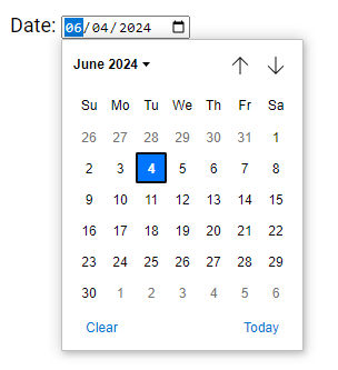
You can use the min and max attributes to set date restrictions.
<form>
  <label for="datemax">Date before:</label>
  <input type="date" id="datemax" name="datemax" max="1996-12-31">  <br><br>
  <label for="datemin">Date after:</label>
  <input type="date" id="datemin" name="datemin" min="2004-01-02">
</form>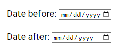
Input Type Datetime-local
The <input type="datetime-local"> specifies a date and time input field without a time zone. Depending on browser support, a date picker may appear in the input field.
<form>
  <label for="datetime">Date & Time:</label>
  <input type="datetime-local" id="datetime"  name="datetime">
</form>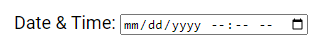
Input Type Email
The <input type="email"> is used for input fields that should contain an email address. Depending on browser support, the email address can be automatically validated upon submission. Additionally, some smartphones recognize the email type and may add ".com" to the keyboard to facilitate email input.
<form>
  <label for="email">Email:</label>
  <input type="email" id="email" name="email">
</form>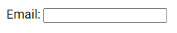
Input Type File
The <input type="file"> defines a file-select field and a "Browse" button for uploading files.
<form>
  <label for="file">File:</label>
  <input type="file" id="file" name="file">
</form>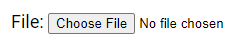
Input Type Hidden
The <input type="hidden"> defines a hidden input field, which is not visible to users. Hidden fields allow developers to include data in a form that cannot be seen or modified by users when the form is submitted. They are commonly used to store information such as the database record that needs to be updated when the form is submitted.
Note: While the value is not displayed to the user in the page's content, it is still visible and can be edited using browser developer tools or "View Source" functionality. Therefore, hidden inputs should not be relied upon for security purposes.
<form>
  <label for="fname">First name:</label>
  <input type="text" id="fname" name="fname"><br><br>
  <input type="hidden" id="custId" name="custId" value="3487">
  <input type="submit" value="Submit">
</form>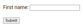
Input Type Image
The <input type="image"> defines an image as a submit button, with the path to the image specified in the src attribute.
<form>
  <input type="image" src="img.webp" alt="Submit" width="200px" height="200px">
</form>
Input Type Month
The <input type="month"> allows the user to select a month and year, and depending on browser support, a date picker may appear in the input field.
<form>
  <label for="month">Month & Year:</label>
  <input type="month" id="month" name="month">
</form>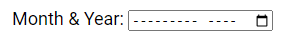
Input Type Number
The <input type="number"> defines a numeric input field, and you can set restrictions on the accepted numbers. For instance, the following example displays a numeric input field where values from 1 to 10 are accepted.
<form>
  <label for="number">Number:</label>
  <input type="number" id="number" name="number" min="1" max="10">
</form>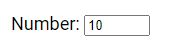
Input Type Password
The <input type="password"> defines a field for password input.
<form>
  <label for="username">Username:</label><br>
  <input type="text" id="username" name="username"><br>
  <label for="pwd">Password:</label><br>
  <input type="password" id="pwd" name="pwd">
</form>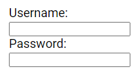
Input Type Range
The <input type="range"> defines a control, similar to a slider, for entering a number where the exact value is not critical. By default, the range is from 0 to 100, but you can set restrictions on accepted numbers using the min, max, and step attributes.
<form>
  <label for="range">Range:</label>
  <input type="range" id="range" name="range" min="5" max="40">
</form>
Input Type Reset
The <input type="reset"> creates a reset button, which resets all form values to their default values.
<form>
  <label for="fname">First name:</label><br>
  <input type="text" id="fname" name="fname" value="John"><br>
  <label for="lname">Last name:</label><br>
  <input type="text" id="lname" name="lname" value="Doe"><br<br>
  <input type="submit" value="Submit">
  <input type="reset" value="Reset">
</form>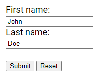
Input Type Search
The <input type="search"> is utilized for search fields, which function similarly to regular text fields.
<form>
  <label for="search">Search:</label>
  <input type="search" id="search" name="search">
</form>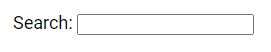
Input Type Tel
The <input type="tel"> is used for input fields intended to contain a telephone number. The pattern attribute can be used to restrict the input to a specific format. Pattern attribute is not supported in all browsers , so additional validation may be necessary.
<form>
  <label for="phone">Phone Number:</label>
  <input type="tel" id="phone" name="phone" pattern="[0-9]{2}-[0-9]{3}-[0-9]{7}">
</form>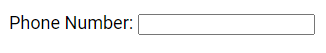
Input Type Time
The <input type="time"> allows users to select a time without specifying a time zone. Depending on browser support, a time picker may appear in the input field.
<form>
  <label for="time">Time:</label>
  <input type="time" id="time" name="time">
</form>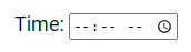
Input Type Url
The <input type="url"> is used for input fields intended to contain a URL address. Depending on browser support, the URL field can be automatically validated upon submission. Additionally, some smartphones recognize the URL type and may add ".com" to the keyboard to facilitate URL input.
<form>
  <label for="website">Website:</label>
  <input type="url" id="website" name="website">
</form>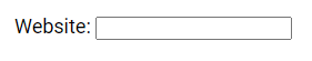
Input Type Week
The <input type="week"> enables users to select a week and year. Depending on browser support, a date picker may appear in the input field.
<form>
  <label for="week">Week:</label>
  <input type="week" id="week" name="week">
</form>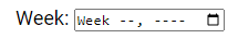
Input Restrictions
Here are some common input restrictions.
checked: Specifies that an input field should be pre-selected when the page loads (for type="checkbox" or type="radio").
disabled: Specifies that an input field should be disabled.
max: Specifies the maximum value for an input field.
maxlength: Specifies the maximum number of characters for an input field.
min: Specifies the minimum value for an input field.
pattern: Specifies a regular expression to check the input value against.
readonly: Specifies that an input field is read-only (cannot be changed).
required: Specifies that an input field is required (must be filled out).
size: Specifies the width (in characters) of an input field.
step: Specifies the legal number intervals for an input field.
value: Specifies the default value for an input field.
Here we have an example of a numeric input field. Acceptable values range from 0 to 50.
Increments or decrements occur in steps of 5. The default value is set to 15.
<form>
  <label for="number">Number:</label>
  <input type="number" id="number" name="number" min="0" max="50" step="5" value="15">
</form>
Please check below options for the links to our previous or next tutorial.